Sonntag, 5. November 2017

Mortarion - The Lord of Death - Part1

A long journey


Mortarion definitely has been one of the most challenging projects I have done so far. There is the obvious crazy level of detail and the variety of materials. Also the pose adds its own level of difficulty to the painting. But I think it is the sheer size that is the most challenging aspect. Using the word "miniature" for this beast sounds almost like a joke. With "minis" like this just finishing it is an achievement in itself and it requires some proper discipline to do so. All in all it took about a month from start to finish with something like 5 evenings of painting every week.


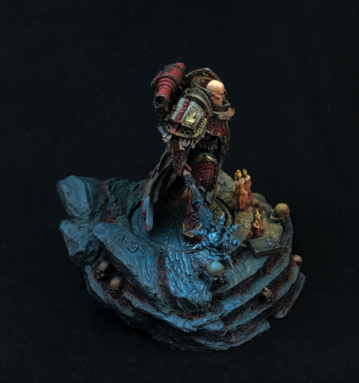
In the end I am really happy with the result and a lot of the miniature went pretty much exactly as planned (which is a rare thing for my way of painting). My goal was first and foremost to find a way to paint him that is different from the "official" Game Workshop style and pushes the idea of him being a former Primarch of a Space Marine Legion - a little less demon, a lot less decay and filth but also a lot of age.


Painting becomes a lot easier if you try to imagine a small narrative to the scene you are trying to show. My version of Mortarion shows him while attacking one of the beautiful worlds of Ultramar - specifically a beautiful and lush garden. He has just arrived but his influence already starts to spread corruption and decay. The touch of his cloak will let the giant blossom under him rot away in seconds and we see the beginning of that in the miniature.
The base and it's beauty is one of the major contrasts against the old evil and decay that Mortarion stands for. To connect mini and base I decided for the idea of the beginning decay of the blossom. I had bought a number of these and decided between a rather perfect and round version and a slightly crumbled and shrunk version. I chose the latter to strengthen the idea of it being in the early stages of rotting away. The rest of the base was created to look beatiful and nice - a place you would want to visit.


Another important aspect for me was the age of Mortarion. He is way over 10.000 years old at this point and I wanted that to show that but not in the "classic" Nurgle rot way. The final idea came from his title: The Lord of Death.
The rather obvious association here is bones, old bones. I researched pictures of old and weathered bones online. There is essentially two: bones weatheres in the open like in a desert which are bright and almost white and the bones that have weathered in the ground. Those have a brown tone and they can be littered with tiny cracks. I cannot show the pictures I used for reference here as I do not own the rights to them.
I did a number of tests on Plague Marines and in the end came up with what you can see above: a brown to yellow tone with a hint of red in it. An important element to sell it are the micro cracks that go all over the surface. The whole armor has those and while they are hard to notice from a distance they give a nice detail when the mini is looked at more closely.

Beginning of a journey


The Mortarion kit is crazy and fantastic and also not easy to work with. Usually I like to build minis only so far that I can still easily reach all surfaces with the brush. This kit makes that difficult. I had to put most of the main body completely together to avoid major construction and correction work after the painting. This  means that some of the surfaces are really hard to access. I left both hands, the wings and all attachments separated. As you can see above that is a huge number of parts.


Everything was primed in black and than I sprayed white mainly from above. I do this for two reasons. The white surfaces will show more vibrant colors later and even though the effect can be rather subtle after all the painting is done it is still visible. Even more importantly it is easier to actually see and study all the details of the miniature.
I usually spent a lot of time with the mini at that point to find and think about all the details it has.


The Armor

As mentioned above my goal was to give the armor the appeal of old dried and brittle bones. At the same time I wanted to avoid the classic Death Guard colors. Neither the 40k greens nor the 30k white appealed to me.
So I decided for brown and yellow with a hint of red. Below you can see the first stage of the painting process on the leg. The base color is a more or less equal mix of P3 Rucksack Tan and Scale 75 Brown Leather. For the darkest shadows I added Armypainter Flat Black and the highlights are made by mixing in Vallejo Model Color Ivory.
On top of a clean coat of the base color I wetblended from shadows to the highlights. For that I had prepared six stages from the darkest shadows to the highlight color on my wet palette. The fact that Scale75 colors are pretty transparent makes the blending a bit easier. Blending errors were fixed with appropriate glazes. The modeled holes in the armor were simply painted in the shadow color and received 2 step highlighting on the lower part. The black-white foundation made it easy to hit the right amount of light-dark contrast on the leg.


Now I started adding the micro cracks. I wanted them to look like a cracked egg and I made them very fine. Even this picture does not show them in all the detail. I also did not want to make them to obvious to keep the overall shading of the surface alive.
I painted very fine lines in the shadow color or even black in the already shadowed areas that looked a bit like the forked lightning. Then I painted dots and lines with a highlight color on the underside of the cracks. I took care to avoid long clean lines to strengthen the appeal of a rather rough and uneven surface. The edge highlights were done in a similar way so they also get a battered and broken appeal. Short lines and dots instead of one clean line are key for that effect.
At a last step I used a glaze of Vallejo Air Armor Brown mainly into the shadows to deepen the shadows and give the whole surface a bit more vibrance.


The picture below shows the cracks and coloring best on the two tanks on his back. I used this scheme on all armor parts on the model.


Stay tuned for the continuation of this in my next post.

-André

Sonntag, 23. Juli 2017

Lorgar - finished

I bought this Mini because Lorgar of all the Primarchs had a real choice and went to Chaos willingly. Being rejected by the Emperor and trying to save Mankind might have been the start but the choices he made fully knowing. How does such a person/being look like after that decision - like a demon, like a madman, like a killer? I think when he made the decision he felt like he had to be the father of mankind that his father could not be. 
So when I thought about painting him I wanted to give him a stern but very human look - someone you could like and respect. But also there should be a hint of the madness and evil.
The face looks very realistic and human. The books show him as a scholar though some books probably are better left unread. 
The light from the candles and the mace were mainly me experimenting with OSL but I actually think the contrast between warmth and coldness support the mood I wanted to achieve.

You can find the tutorial on how I painted the face here!


Freitag, 23. Juni 2017

Painting the Lord of Contagion

Introduction


I was asked in my local Game Workshop whether I would be interested in getting a miniature of the new Warhammer 40.000 box before release to paint it and maybe write a little step by step about it. It was not hard for me to say yes - especially as it meant getting my hand on one of the new Nurgle models.
The amount of detail on them is staggering and the Lord of Contagion is probably the "worst" of them. It was a lot of fun and required quite a bit patience to paint this one.

My goal with this miniature was to have a "typical" Nurgle miniature + a lot more colors. I used a number of reference pictures from the web but mostly referred to pictures of shipwrecks. Those are probably the best example of very colorful rot.


Preparation


I primed the miniature in black and added zenithal highlighting from the top with white. I did use an airbrush for this. The miniature is very complicated and the lower picture shows the separate pieces I had for painting it. Especially this miniature would be a lot harder to paint when fully assembled. As you can see I am using miniature holders which is a big help and makes painting just a lot more comfortable. For the black + white priming I bluetacked the mini together.

The armor


I started with a basecolor of Scale75 - Field Gray. It has a nice greenish tint and is dark enough to allow nice contrast to the highlights and shadows. As I wanted to give the mini more colors then the "classic" Nurgle Scheme I wet blended into P3 Rucksack Tan on the feet and SC75 - Anthares Red on the upper Torso.


The next step was sketching in the first lights and shadows using a mix of White + Rucksack Tan and Vallejo Armor Brown + Rucksack Tan. 


After that I glazed the base color over that to smooth things out. Then I reintroduced shadows and lights and strengthened them with ever stronger mixes towards White and Armor Brown - using glazes of the base color to smooth over. You can get an idea of the approach in my face painting tutorial here: http://miniatures-nechromus.blogspot.de/2017/05/painting-face-with-sketching.html. The picture above shows the result of me testing the approach on the left foot.


The mid section was done in a very similar way. I used Vallejo - Dark Sea Blue for the shadows and white again for the high lights. I also added rust stains and holes already to get a better feel for the overall decay of the armor. Later I glazed over the mid section with Rucksack Tan to getter a better connection to the lower part.


As I have painted so many red miniature by now red is something I am very used to. This time I used Dark Sea Blue and later a bit of Armor Brown for the shadows. Highlighting red is a bit special. I use various shades of pink to do that which I then glaze over with the base color to reduce the "pinkishness" a bit. I find it important to put the final highlights in almost white (still a bit of red in it) as this makes things pop properly in the end. If things look too bright or too pink I use glazes to reduce the effect. I also tried adding some veins in purple to the upper part of the armor but I think in the end that did not work out so well. They are still visible in the final mini but did not give me quite the effect I was hoping for.


I painted the belly using my skin tone technique (http://miniatures-nechromus.blogspot.de/2017/05/painting-face-with-sketching.html). I wanted a very alive look for the skin to make the whole thing contrast with decay of the armor and also simply to make it look more gross.


The intestines where painted in grey and purple and highlighted rather sharply to give them a wet look. The skull (I love painting skulls) was done using black, white and SC 75 - Brown Leather. I mixed a greyish brown as my base color and used the sketching technique to get highlights and shadows smoothed out. I decided to go for the bright green to set a point of strong contrast in the area and also have something to discover when looking at the miniature. I also painted all the metal parts in a dark brown (GW - Rhinox Hide) to get a better understanding of the color and brightness setup.


The metallics where a bit of a challenge as I wanted to have the bright reflexes of metal as a contrast in the mini but also wanted them to follow the decay idea of the rest. I painted the highlights over the dark brown foundation with a mix of Valejo - Black Metal and brown. I did the shadows with glazes of army painter Matt Black + brown. I like the effect of the matt black on metallics as it allows to control the reflectiveness of the surface very well. By placing it right I can remove the shine of the metallic color where I want to. Edges where highlighted by dabbing Vallejo - Chrome. I tried to avoid strait lines here to give the metal a more broken feel. The final step was introducing the rust by multiple targeted washes of orange. I also painted on rust streaks on the surrounding armor by glazing in orange + brown mixes.


I decided for a garish pink for the tentacle. It will be somewhat hidden by the cloak later on and I wanted to make sure that it still would stand out enough. The backside of it was painted with purple. To give the tentacles more structure I exagerrated the backside and added the white spots on the side. This is a good example to adding additional detail by painting it on.

The head

Originally I had the intention of painting the head in white or bone color (similar to the one on the feet). Once I had the armor done I felt I wanted to continue the idea of the red of the upper third.


I used a similar pink to the one I used for the tentacles. I wanted the view to be drawn to the head. This miniature has so much detail that I felt I needed a very clear target for the viewer. The metal of the horn was done exactly like I had done it on the armor.

The Arms


I replicated the rucksack tan - to green fade I used on the legs on the arms.


The axe-blade was done by blending from purple-metal on the lower tip to a green-metal in the middle and a turquoise-metal in the upper corner. I wanted to give the blade a bit of sickly looking oily feeling.
The leather strapping was done by using GW - Rhinox Hide as a base color and then highlight up with mixes of Rhinox Hide and Vallejo Elven Flesh. I have used that approach before and the Elven Flesh gives a nice natural looking highlight to the reddish Rhinox Hide.

The Cloak

Initially I had tried to paint the cloak by simply using Army Painter Strong Tone in multiple layers directly over the black+white primer but at the end I felt that it had gotten too dark. So I decided to "restart" the cloak by applying Vallejo - Bone White with the airbrush directly over it. You can see the result below.


The armor parts I had painted with Field Grey and added the Anthares Red to mirror the upper part of the armor.


By glazing with SC - Brown Leather I pushed the shadows and tinted the surface as a whole. After that I reestablished the highlights by glazing with Bone White. The dirt at the lower end was stippled with SC - Brown Leather and Orange. I also splattered the cloak with drops of brown leather and orange.


I blocked out the metals in black and got the rusty feeling by using different mixes of Orange + SC -Brown Leather.


I struggled a bit with finalizing the armor pieces. With soft color transition it all looked very boring. When I started to add even more heavy scratches then the ones modeled into the miniature the whole thing started to feel right.
The big horn was done by first wet blending from Vallejo - Armor Brown to P3 - Rucksack Tan. Then I painted a lot of fine lines in pure Armor Brown, Rucksack Tan and Rucksack Tan + White mix. After that I glazed over it with Rucksack Tan and Armor Brown. That way I wanted to achieve a rather natural look of living piece of horn.


I did the metals in "classic" TMM style. I used the metals very sparingly and highlighted up to a Vallejo - Chrome + Vallejo - Blackmetal mix to leave the pure Chrome for the edge highlights. I softy applied metal colors to the chainmail pieces. I used it only very sparingly to not ruin the nicely rusted and weathered effect. Then I applied orange wash to simulate rust where it made sense.
The actual nurgle symbol I did with bronce colors (I do not remember which colors exactly). 
The heads in the Nurgle Symbol used colors schemes I had used elsewhere on the mini: the pink of the tentacle and head, the skull was done the same way as the one hanging down on the armor. The Nurgling was done using Vallejo - Darksea Blue. I planned to do one of the Nurglings the mini stands on with that color.


Getting the smoke working was a bit painful. I used Vallejo - Turquoise. But it took multiple tries and layers to get to the final result. I cannot say that I am completely happy with the final result of the smoke but I simply ran out of time. ;-)

The final result


I am quite happy with the final result. I feel I managed to break up the monotone Nurgle green with colors and still retain the overall greenish appeal. He seems properly disgusting.


Montag, 1. Mai 2017

Painting a face with sketching

Introduction


This tutorial is based on me using advice and suggestions I took from the tutorials done by notoriginalminis.com. I am trying to apply these ideas to painting 40k and 30k minis among others.
The basic principle of this approach is to use bold sketchy strokes and then refine with ever less sketchy strokes. This is combined with layering over half transparent colors and by that smoothing out and unifying the blending. Without further ado - let's start.

Priming and base coat

I primed with black and then "dusted" the face with white from the direction of the main light source. This is as much used to give me a good light and shadow foundation as it is used to show me the details of the face. This where I actually get a good understanding of how I want to do the paint job.
 
 
The next step was a thin layer of Scale75 Golden Skin (any warm skin tone would work here). This is my skin base tone. It is important that the black and white foundation shows through. I just tried to avoid pooling and too obvious stains. But it is not necessary to be very neat here. Do not forget we are sketching. This even more visible in the next stage: the shadow sketch. It is very important to have the first layer dry completely before you go on.

Sketching


As you can see this is a rough sketch. I am using Scale 75 red leather (a dark red brown tone). The pictures show where it needs to be applied. Next step: lights.


To complement the shadows I sketch in the light using Vallejo Elven Skin (a pale and light skin tone). Again do not bother with blending or being overly neat. It is important to get an idea about light and shadow situation here. The refining comes later. Still it looks more like a skinned skull with the muscles showing at this point. A unifying layer of the base tone will help here.


This layer of the skin base color should applied heavily thinned down. Try to make sure that it is applied as even as possible. You might have to do two. But as seen in the pictures the light and shadow show through. It still looks rough and also the contrasts are not strong enough. We will improve that in our next step. 


The deepest areas of the face like the eyes, under the nose, the lines separating the cheeks, under the chin, the lines under the eyes and so forth receive dark shadows - a mix of black and the shadow color (red leather).


Over that dark shadow another thinned down layer of shadow color was applied. This covers larger areas and as you can see also brought back the color into skin.


Refining

The transition from sketching to more fine work is blurry in this approach but let's say that from this point on the steps are more targeted and controlled then before.


Here I used the base skin color for unification again. I used it heavily thinned down and applied it to the transition between shadow and light areas. Here I pushed the color from the shadow into light areas. Make sure that the face is dry before you apply subsequent layers.


This shows my second layer of lights. As usual the color is thinned and is applied by pushing it into the light areas. The fact that the color is thinned down will create a smooth transitions.


To smooth out transitions another layer of the base color is applied over the rougher transitions.

At this point I felt that the face was moving into a much to pale direction.
 
 
I applied a heavily thinned down layer of orange over the whole surface. Rather err on the thin side and use multiple layers. The result is a much more tanned look. Still the skin lacks one important quality - life.


A thin glaze of pure red was applied to areas to have more blood flow in the face, the cheeks, the temple, around the nose tip, the eyes and so forth.


I used the skin base color for a first step to reestablish the highlights. I also used red leather to strengthen the shadows again


The strong highlights come back with the highlight color - Elven Skin. I also used it for the eye balls and the teeth.

Finishing

Smoothing things out and giving it the final touches come next.


This step was again using the base skin to smooth out transitions.

Below you can see the final pictures. This was after about an hour of using thinned down shadows, base skin and highlights to accentuate and smooth out things. I cannot give concrete steps here except for one: the eyes.

The Eyes

It took 3 tries to get the eyes acceptable so do not be mad if it takes a while. The steps are always the same:
1. the whole eye is painted in the dark shadow color
2. eyeballs are painted - do never use White for this but light greys or like here the highlight color
3. paint the iris with a very dark color (black or dark brown or dark blue)
4. the next step is the most important - the White dot for the reflection in the eye - this makes it come to life


This sketching approach might look like a lot of wasted steps but by getting ever more detailed it is much easier to establish light and shadow and colors and the finish is much smoother as the transitions are developed over time.